July 31, 2026 · 7 min
Storytelling With Data: Charts That Argue, Not Decorate
Consulting charts have one job: advance the argument. Here's the discipline behind exhibits that move decisions—and how to build it before you need it.
A Chart Is a Sentence in the Argument
In consulting, a chart is never an illustration—it's a claim with evidence attached. Each exhibit exists to make one point the audience must accept for the recommendation to stand. If the point can't be stated in one sentence, the chart isn't ready.
This inverts the usual workflow. Amateurs plot the data and look for something to say; professionals write the sentence first and build the display that proves it. Message first, chart second, always.
- One chart, one claim—write the sentence before plotting anything
- Every exhibit must be necessary to the recommendation's logic
- If a chart supports two messages, split it into two charts
Choose the Chart by the Comparison
Chart type follows from the comparison in your sentence. Change over time wants a line. Ranking across categories wants ordered bars. Contribution to a total wants a stacked bar or waterfall. Relationship between variables wants a scatter. The message dictates the form—preference doesn't enter into it.
Two forms earn special mention in consulting work: the waterfall, because profit-bridge stories are the industry's bread and butter, and the humble ordered bar, because it beats the pie chart at the pie chart's own job in almost every case.
- Time → line; rank → ordered bars; composition → waterfall or stacked bar
- Learn the waterfall cold—profit bridges are consulting's native story
- When tempted by a pie, try ordered bars first; they usually win
Declutter Until Only the Message Remains
Every element that isn't carrying the message is stealing attention from it: gridlines, borders, legends that could be direct labels, precision beyond what the decision needs. The consulting standard is austere for a reason—the audience gets seconds per exhibit, not minutes.
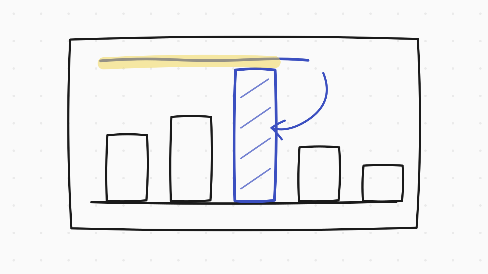
Then add emphasis with intent. One series in a strong color while the rest sit in gray; the key bar highlighted; the anomaly annotated where it happens. Emphasis is the visual form of prioritization—use it exactly once per chart.
- Remove gridlines, borders, and legends before adding anything
- Label series directly on the chart; legends force eye travel
- One point of emphasis per chart—gray is your strongest color
The Title Does Half the Work
A consulting exhibit carries an action title—the claim, not the topic. 'Retail margin fell eight points while wholesale held flat' beats 'Margin by channel, 2023–2026.' Readers who see only titles should still receive the entire argument.
This pairs with the storyline discipline: exhibit titles read in sequence should form the case's logic. If they don't, the deck has decoration where it needs argument—a review test that takes thirty seconds and catches most weak decks.
- Titles state the claim; the chart below is its evidence
- Read all titles in sequence—they should reconstruct the argument
- Topic titles ('Revenue overview') are placeholders, not titles
Honest Emphasis: The Line You Don't Cross
The same tools that clarify can deceive: truncated axes that inflate differences, dual axes that manufacture correlation, cherry-picked windows that hide the reversal just off-chart. In consulting, getting caught once costs the asset the entire engagement runs on—the client's trust in your numbers.
The working rule: emphasis may direct attention, never manufacture it. If the effect disappears with a zero-based axis or a wider time window, the effect was the formatting. Show the version that survives scrutiny, and flag the caveat before the client's analyst finds it.
- Zero-based axes for bars, always; note any truncation on lines
- If widening the window kills the story, the story was the window
- Surface caveats yourself—credibility compounds, and so does its loss
Building the Skill Before the Job
The practice loop is simple: take any data story from the news, write the one-sentence message, sketch the exhibit on paper—title, chart form, emphasis—then compare with what the publication ran. Sketching by hand keeps the focus on the argument rather than the software.
For candidates, this skill surfaces in exhibit-reading and in final-round presentations; for new consultants, it's the difference between producing pages and producing argument. Either way, the muscle is built the same way: message first, one chart at a time.
- Sketch exhibits on paper from news data—message, form, emphasis
- Critique published charts: what's the claim, what's the clutter?
- The skill transfers directly from interview prep to the job itself